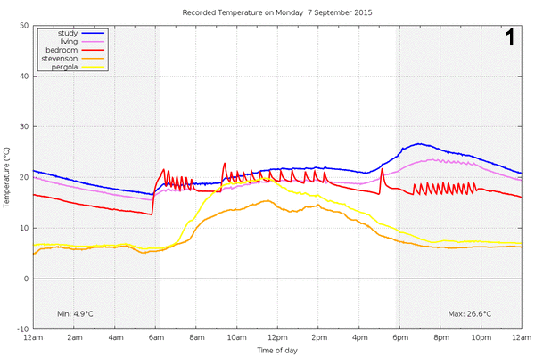
Here’s a week’s worth of temperature data from around my home. The blue, pink and red series are indoors. The orange and yellow series are outdoors - one inside a homemade Stevenson screen and the other under a pergola on the eastern side of the house.
The indoor readings were produced by DS18B20 one wire temperature sensors connected to nodemcu (ESP8266) wifi internet of things devices. Each sensor+nodemcu arrangement publishes the temperature once per minute to an MQTT broker.
The outdoor readings come from off-the-shelf WH2 temperature sensors. Their 433MHz radio packets are decoded by an Arduino with an ethernet shield which relays the packets, also to the MQTT broker.
A Ruby script subscribes to the temperature topics and logs each reading to an sqlite3 database.
A cron job generates the plots above every 15 minutes using gnuplot.
The plots tell an interesting story of a week in (southern hemisphere) September getting progressively warmer. The wild oscillations in the red series are when the ducted gas heating was operating. The gas heater has some hysteresis - after reaching its set point, it will cut off and wait for the temperature to cool a couple of degrees before turning on again. When the outside temperature is lower the heater cycles more frequently and the ocillations on the red plot bunch up. The heater is burning gas more of the time, to compensate for losses and to keep us warm!
The rest of the indoor readings are less affected by the gas heater. These are influenced more by a slow combustion wood stove. It produces more and more heat as the evenings wear on and tends to swamp any contribution from the gas heater in those parts of the house.
In the first plot it’s easy to tell that someone was at home during the day, since the gas heater was operating. Ambient data - even something as innocuous as temperature data - can be used for snooping!
The third plot shows a light frost, but by week’s end the outside temperature has warmed sufficiently that heating is only required in the morning.
The Stevenson screen does a better job of recording the outside temperature. One can infer that the pergola is on the eastern side of the house because its temperature sensor reading overshoots in the morning, because it is directly heated by the sun. By the afternoon it tracks closely with the Stevenson screen sensor, since it is now in the shade. But it always reads a little higher because it is sheltered by the house.
The gray/white background shows local sunrise and sunset times. The day length is close to 12 hours since the equinox occurs in September. It’s interesting to observe the outside temperature build a little after sunrise.
Data quality is always an issue. In the third plot, the pink series drops out. Why? It could be the nodemcu device crashing, the wifi dropping out, the connection to the MQTT broker failing… Such is the complexity of the internet of things. Nevertheless, interesting data to explore.