In a recent post, I wrote about reverse engineering the protocol used by the WH2 outdoor wireless weather sensor that came with my weather station. I was able to use the excellent Saleae Logic to capture several transmitted packets under various conditions (i.e. for different temperature and humidity readings). But in order determine which parts of the packet were changing for a given change in the readings, I needed to present the captured packets side-by-side.
To accomplish this task, I used the Logic’s data export facility and GNUPlot. In this post, I present a tutorial-style account of what I did. The idea for this tutorial came from a comment I received in response to that earlier post.
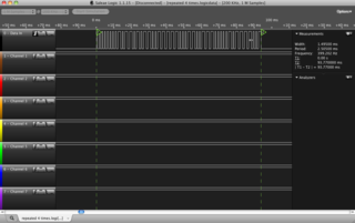
The first step is to capture your data using the Logic. Ensure that each time you sample, you maintain the same sample rate. Use the start (T1) and finish (T2) markers to mark the beginning and end of your packet, as follows:
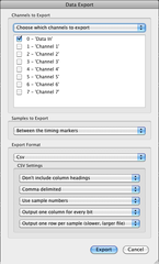
Next, you need to export the data to CSV. Configure the export dialog box as shown below. We are asking the Logic software to export just the data for the first channel (which contains the serial datastream). We restrict the export to between the markers so that our exported CSV contains exactly one packet and the start of the CSV file is aligned to the start of the packet. We export in CSV since this is easy to transform into something palatable to GNUPlot and exclude the header row because it just gets in the way. We output one row per sample. This produces a lot of data, even with the modest sample rate used here, but it makes it very easy to graph.
The exported CSV file will consist of lines like this. The first column contains the sample number and the second contains the sampled logic state of the first logic analyser input:
The starting sample number will vary from one CSV export to another. We can renumber the samples they start at 0 using the following chain of commands. Substitute “logic_export.csv” with the CSV file exported from the Logic software. The transformed data will land in “gnuplot_in.txt”. Modify as required.
This will transform the output to look like this. You’ll note that the samples now start a “1”. The file is now space-delimited, which is exactly what we want for GNUPlot:
Repeat the above process of acquiring, exporting and transforming the data for each sample you want to display in GNUPlot. In my case, I produced four files, as follows, which I named according the Relative Humidity and Temperature encoded in the sample:
69251.txt # 69% RH 25.1 degrees C
70258.txt # 70% RH 25.8 degrees C
71048.txt # 71% RH  4.8 degrees C
74-40.txt # 74% RH -4.0 degrees C
The penultimate step is to produce a file that tells GNUPlot how to plot your data. The file below instructs GNUPlot to plot four graphs stacked horizontally. Substitute the file names (e.g. “69251.txt”) as appropriate. Also modify the “title” as required. Save the GNUPlot file (say as “logic.gnuplot”) to the same directory as the data files:
The final step is to invoke GNUPlot and load the configuration file:
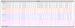
If all goes well, a plot like the one below will be displayed:
Seeing the data side-by-side makes it much easier to reverse engineer the packets. For instance, it becomes clear instantly that every packet begins with a blurt of brief pulses followed by a long pulse. The blurt is a preamble that allows the receiving device to set its auto-gain control (AGC) to the appropriate level before the date proper is sent.


